
As the world becomes more screen focused, the amount of energy put into crafting a smart and thoughtful user experience becomes more important. The overall User Experience (UX) is the design of the information organization and architecture, and the User Interface (UI) is the visual elements and design.
There are many UX design principles that can be used at a macro or micro level in order to create a more positive user experience on your WordPress site. Here’s a look at three of them; Hick’s Law, Fitt’s Law and Miller’s Law.
Hick’s Law
Hick’s Law states that “The time it takes to make a decision increases with the number and complexity of choices.”
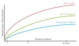
It’s easy to think that you’re giving the user what they want by giving them an abundance of choices, but in actuality you’re creating a cognitive burden for them. “The more choices a user is confronted with, the more likely they are to walk away, crippled by ‘decision paralysis’. This can be particularly problematic in an e-commerce context, where users walking away leads to a direct impact on the bottom line.”
Now, how can this actually be applied in the context of a WordPress site?
- When creating the navigation, do not provide an endless list of choices, focus on just a few. Then you can nest further options within these, when applicable.
- In an e-commerce scenario, present specific parts of the process one step at a time. A great example is the checkout process. Instead of showing all of the necessary information all at once, break the screens down stepwise. Show the shopping cart details, another with the delivery information, then an optional account creation.
Fitt’s Law
Fitt’s Law states that “The time it takes to acquire a target is a function of the distance to and size of the target.”
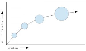
Thinking of the target as a button on the screen, this translates as the further away a button is, the larger it needs to be for a user to reach it was ease. Now when taking into account that on mobile devices we use our fingers instead of mouse pointers, their inherent lower fidelity means we need to increase the tap target sizes.
Additionally, Fitt’s Law helps us to keep in mind:
- If you have a large button, ensure that it’s a primary call to action. If not, you’ll be confusing your users, and could be sending them in the wrong direction.
- When creating dropdown menus, make sure your targets are large enough for the user and large enough for mobile vs desktop.
Fitt’s Law is an easy one to see how it could be used incorrectly. Without a discerning eye, it’d be easy to use it as reasoning to make everything as large as possible, losing any hierarchy at all.
Miller’s Law
Miller’s Law states that “The average person can only keep seven (plus or minus two) items in their working memory.”
In essence, what Miller’s Law makes clear is that there’s only so much we can hold in our minds in a short period of time. This puts into focus how important it is to intelligently organize and synthesize information. This could be through chunking information or having your designer use hierarchy throughout your visual design. A previous post, Using the Eye’s Scanning Patterns on the Design of Your WordPress Site, gives some good ways to organize information.
Conclusion
In the end, all of these laws come back around to explain why when trying to make sense of complex information on your WordPress site, less is more! Make sure to put in the work necessary to intelligently present and organize the information you do put in front of your audience. They’ll thank you for it by staying on your site longer!
Related Guides and Resources
- Why Your WordPress Site Is Not as Secure as You Think: Key Misconceptions In the rapidly evolving digital landscape of 2025, a secure online presence is non-negotiable for…