Related Resource: Website Redesign
Recent studies show that people are more likely to scan your WordPress site rather than going through each block of content one at a time. Thankfully, there are ways in which good design can use the eye’s natural scanning patterns to guide them to the most important elements. A 200 site study has found noticeable eye scanning trends and sites that follow these principles can create a positive user experience.
All cultures read from the top down to the bottom. For cultures that read left to right there are two common natural scanning patterns, the F-shaped pattern and the Z-shaped pattern. The F-pattern is best used for text heavy sites, while the Z-pattern is more appropriate for clean, more minimal sites.
The F-pattern
Being that the F-pattern is for text heavy scenarios, such as blogs and articles, the F-pattern comes from the reader looking vertically for keywords or points of interest. When they find something of value, they switch to reading normally from left to right. Thus, the F shape is created.
Jakob Nielsen of the Nielsen Norman Group conducted a readability study based on 232 users scanning thousands of websites and found that “research shows that the F-shaped scanning pattern is alive and well in today’s world — both on desktop and on mobile.” Well known websites that use this F-pattern are CNN and the NYTimes. Below is a visual heat map created by the Nielsen Norman Group showing the F-pattern.
![]()
Now, how can this be applied to the design? In terms of the written content, the first two paragraphs are the most important. Therefore they should contain a hook to pull them in further. In addition to the first two paragraphs, start any other paragraphs, headers, subheads and bullet points with keywords.
The Z-pattern
In contrast, the Z-pattern comes from the eye’s scanning approach on website where there is less text and more space. The reader looks across the top of the page from left to right, and then drops down to the bottom left corner and scans across again. Shown below is the Z-pattern eye scan in action, via +tutsplus.
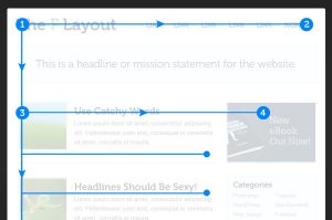
In terms of design, when applying the Z-pattern, the most important items are placed along the corners. Other important items are placed along the top and bottom, visually connecting them diagonally. The Z-pattern tends to be appropriate for many more sites than the F-pattern, because it addresses hierarchy so well. An example is Asana‘s website layout. The creation of such a well organized structure, addresses the main components of a site:
- Brand
- Hierarchy
- Structure
- Call to Action
The F-pattern and the Z-pattern are simply observations of how the human eye moves and takes in information. Following these trends can create an easy and natural way to organize a website’s content. However, it’s worth remembering that these are guidelines that are not meant to be rigid rules. And sometimes a great designer can successfully break them! For a deeper look at some of the components that can influence the hierarchy of your site design, read Typography and Web Design.