Forms. They are the worker bees of the internet. They allow your visitors to communicate with you. They turn that computer screen into a conversation with you and your company instead of just a spectator event. So knowing what makes forms tick is important. This blog post is all about some of the more interesting details about designing forms so that they are most likely to be used the way that you hope that they will be.
When someone submits a form instead of just eyeballing it and then surfing on down the information highway, we call that a form conversion. Conversion is the objective for any web designer worth her salt, because without conversion (definition: when a user takes the desired action on your site), the website is just another (hopefully) pretty face.
So now that we have some basics down, let’s get down to the details.
1. Less is more. Don’t use even one more form field than you need to.
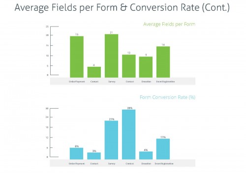
In general, website visitors will run like scared rabbits from long forms. One thing that you can do to keep the rabbit on the page is to have your web developer make the form smarter than the average bunny. For instance, if you have an event registration form, you want to display entry boxes for additional participants only if the person filling out the form selects more than 1 as the number of participants. Just that simple detail will increase conversion rate by reducing unnecessary clutter. For reference, here is a handy graph that describes the average number of fields per form type and conversion rate. Let’s be sure that your forms are shorter than these averages:


2. Use a submit button that your users are most likely to click.
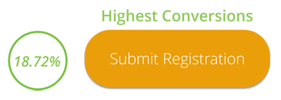
There are so many choices for submit buttons. Round or rectangular, blue or red, flashing or polka-dotted. Just say no. This is one area where extensive user testing has been completed. If there is one submit button to rule them all, it is orange and looks like a pill capsule (see below).


3. Do you know your form’s conversion rate?
WordPress has a few good form systems. One that we like is Contact Form 7, and here is a quick tutorial on getting Google Analytics working to track your form’s conversions. Of course our Projects Team is happy to set this up for you as well. It is a very quick thing for them.
So hopefully this blog post has helped you on your journey to more useful forms. If you want to learn even more about forms and how to get them humming on your website, check out the full 2014 Form Conversion Report from FormStack. It is full of interesting facts about forms.

Comments are closed.