Increasingly people are spending more and more of their time on their mobile devices and less time on their desktops. While the WordPress desktop design is still important, mobile has become more of a priority than ever. So, let us take a dive into some of mobile design’s best practices.
Design for Finger Tap-Targets
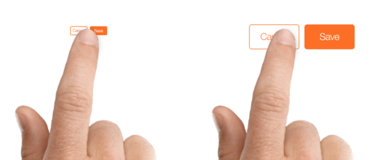
Designing buttons for fingers, instead of the computer cursor, is an important part of designing for mobile. The buttons need to be big enough for the user to tap and to easily understand where it’s taking them. As seen in the example image below, the buttons on the right have a successful finger target size, while the ones on the left do not. The MIT Touch Lab’s Study found that the average size of finger pads are between 10 and 14 mm and fingertips are 8 to 10 mm, making 10 by 10 mm a good minimum touch target size. Just as important as the button size, is the space between the buttons. If multiple buttons are close together, it becomes easy for the user to press the wrong target.
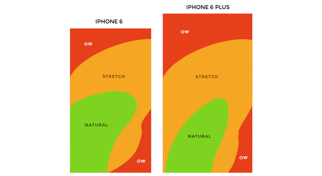
Another element to consider is the thumb zone. When designing for the thumb, it isn’t only about button size, but how users are holding their phone. Most users hold their phones with one hand, which means that only part of the screen is active space where they can effortlessly tap with their thumbs. Other areas would demand a stretched finger or change of grip. Below are the thumb zones for a right-handed person, according to research by Scott Hurff. Making the user experience as smooth as possible is always a goal!
Declutter
Overloading your user with information is not a good thing on a desktop, but it’s even worse on a mobile device. It’s a smaller screen with more scrolling movement, so it’s much easier to cognitively overload someone. Reducing the elements to the absolute essentials will improve your users’ comprehension.
Some key approaches to decluttering include:
- Minimalism: Keep content and UI elements to a minimum. Present the user with only what is vital. Take out any unnecessary elements. Keep decorative elements to a minimum, such as gradients and drop shadows.
- Prioritization: Intelligent hierarchy is key. Have the goal of creating each screen with one purpose and only one call-to-action. This creates an experience that is easier to use and easier to learn. A few clear screens are preferable to a single cluttered screen.
Use Recognizable Screens
Using recognizable screens means using already familiar screens that users have seen in other mobile designs or apps. Examples of such screens are “Getting started,” “What’s new” and “Search results”. These screens have become standardized across most mobile designs. While the desire to create something unique may be strong, this is not always wise. Using these tried and true screens allows users to pull on prior experiences, with no learning curve. No need to reinvent the wheel.
In Conclusion
Good mobile design is vital, with its importance rising everyday. Based on the Worldwide Screen Resolution Stats the most viewed screen resolution in the past year is mobile (360px x 640px), at 18.88%. However, this all comes with the caveat that this is based on generalized user data. Ultimately, what really matters is your audience’s behavior and how they choose to engage with your WordPress site. This is why understanding your own site’s analytics is paramount!