The world of web design has become increasingly diverse. WordPress themes and plugins allow websites to change their layout and format with incredible ease compared to the web technologies of the past. The wide array of formatting options can be confusing when creating a new site, and often brings up several questions: What should my site look like? How can I present my content in the most appealing way? How can I create a small business website design that visitors will be able to intuitively use and navigate?
Thanks to the almost-infinite combination of web design elements, there is no one answer to any of those questions. There is no right or wrong way to display the content of your website. However, there are a few basic layouts that many sites emulate in one way or another. Each of these basic structures have pros and cons, and lend themselves to different types of websites and content.
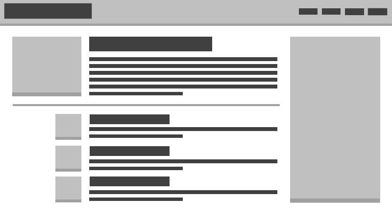
The Blog Feed Layout
This is a very common, simple theme that became popular among WordPress users. As the name implies, this template structure is designed to showcase blog or news content, providing title and excerpt previews to give readers a bit of information before they click a link and dive deeper into the website. Usually, this layout involves a large preview of the most recent post on the site, followed by a listing of the other recent posts in descending order.
Strengths
This layout is ideal for News and Blog websites that put out new content regularly. Having a large preview of the newest post makes it easy for returning readers to find the most recent posts, while the subsequent news feed provides other opportunities to catch readers’ interest. As long as new content keeps coming out regularly, the Blog Feed layout will always have something new to offer visitors when they come back to read more. Since blogs and news websites tend to rely more on text content than heavy images and graphics, the blog feed design also has the benefit of loading very quickly.
Weaknesses
This layout relies on constant content creation to be effective. Without new content, the feed layout never really changes. As a result, returning visitors see the same content over and over again and are not encouraged to explore new pages on the site. If your website is displaying informational content that never really changes, there are better ways to organize and display your content.
Best Blog Feed Layout Examples
Buzzfeed uses this layout to great effect, presenting a wide variety of the days most popular stories on their homepage. Since Buzzfeed creates so much new content, the Buzzfeed homepage is constantly changing and providing new stories to users.
The Single Page Layout
This structure has become more popular recently, especially for smaller business sites and landing pages. The single page layout presents all the website’s content on one long page, often visually organized into different sections. The top of the page usually contains a large graphical element which serves as an introduction to the content that follows. As users scroll through the page, they learn more about the different aspects of the site topic, occasionally with the option to explore a portion of the content in more depth.
Strengths
The single page design is great for websites that do not have much content to offer. It provides a central location where all information can easily be found. The natural progression of this layout also makes it strong for storytelling or brand messaging. Each section of content provides an opportunity to add onto the “story” that is built as the user navigates further down the page. Businesses and product landing pages often gravitate towards this layout, as it provides an opportunity to showcase the various benefits of a product or service, culminating in a Call-To-Action to buy or request more information. Many single page layouts rely on imagery to impart a message as much as text, which can result in a very sleek and modern design.
Weaknesses
The single page layout is designed to be concise; as the content starts to grow, this layout can get unruly. Websites that need to impart more information should break their content up into individual pages so as to prevent users from having to scroll around a massive page to find what they are looking for. Heavy reliance on visual elements and animation can also make this layout heavy and slow-to-load.
Best Single Page Layout Examples
Sourisseaux Partners is a prime example of how to utilize a single page layout. The top of the page provides an engaging graphic, whereas the lower content sections each use imagery and text in concert to give a succinct description of each service. The branding is heavily emphasized and consistently maintained throughout the entire page layout.
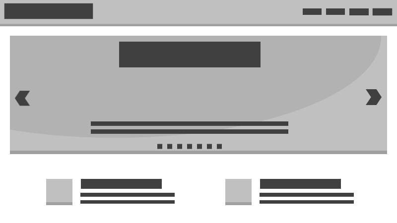
The Slider Layout
The Slider layout is a very common site design. It generally consists of an animated slideshow that dominates the top of the page, with other sections below that contain other pieces of content. Sliders are very popular because they offer the opportunity to showcase multiple pieces of content and their animated nature makes the page feel more alive and interactive. The sections below the slider area offer opportunities to include static information or other relevant site content. This design is popular with business and eCommerce websites, which utilize the slider to display various products or services.
Strengths
The slider is great for grabbing a user’s attention early and encouraging them to explore an interior page of the website. Ecommerce websites can use sliders to showcase their most popular products with an eye-catching graphic, removing the intermediary steps users must otherwise take to get from the homepage to an individual product page. Businesses that have too much information to justify using a single page layout will often use the slider layout instead. It provides the opportunity to use text and graphics to highlight a particular aspect of the business and encourage users to dive deeper.
Weaknesses
Like the single page layout, the slider layout uses a lot of imagery and animation, which can have a negative impact on a website’s performance. The slider is also the focal point of this design, and if does not engage users, there will be little else above-the-fold to encourage users to stay on the website.
Best Slider Layout Examples
Amazon utilizes the slider layout to generate over $100 Billion over revenue per year. Amazon’s slides include engaging imagery and minimal text to showcase the most popular products currently available on the site.
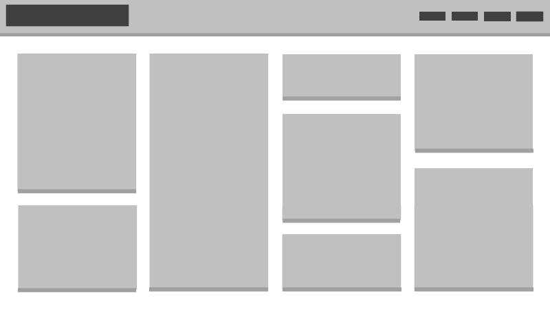
The Grid Layout
The grid layout is very similar to the Blog Feed layout, but emphasizes imagery more than text. This layout consists of a grid of images, each of which represents an individual piece of content. The result is a very visually-engaging design that relies on intriguing images to encourage users to explore the website. Many implementations of the grid layout utilize “infinite-scroll”, which automatically loads in new grid elements when the user reaches the end of the existing listing.
Strengths
As the most visually-dependent of the layouts listed above, the grid layout works well with image-heavy websites. Grid layouts are very common for art portfolio websites, as well as for image-centric social media platforms.
Weaknesses
Again, as an image-centric design, the grid layout presents the opportunity to bloat the website and increase the loading time. Optimizing or lazy-loading images is a must for this type of site. Heavy reliance on imagery also means that text content is scarce; if the website’s content requires a lot of explanation or cannot easily be communicated visually, consider using a different layout.
Best Grid Layout Examples
Pinterest popularized the pinboard-style website, which essentially displays user-generated content in the grid layout design. While Pinterest allows a brief description, the majority of the page is dominated by enticing images designed to encourage visitors to click and explore further.
Deciding on a Web Page Layout
These web page layouts should give you an idea of how to start planning the format of your website, but they are by no means concrete. These layouts represent the most common configurations of a huge variety of design elements. A website can use the blog feed layout and still incorporate elements from the grid layout. A single page website can implement a slider in one of its content sections. These designs can be broken down and rebuilt many different ways, and none of them are correct or incorrect. These web page layouts can help provide a strong base for your website, giving you the opportunity to gradually change and test different design elements until reaching a unique layout that is proven to work for your website.